Search - User list
Full Version: Send Button
Root » Wishlist and suggestions » Send Button
1 2
stefanha
Here are four UI designs for the Send button that I've been playing with:


Some notes:
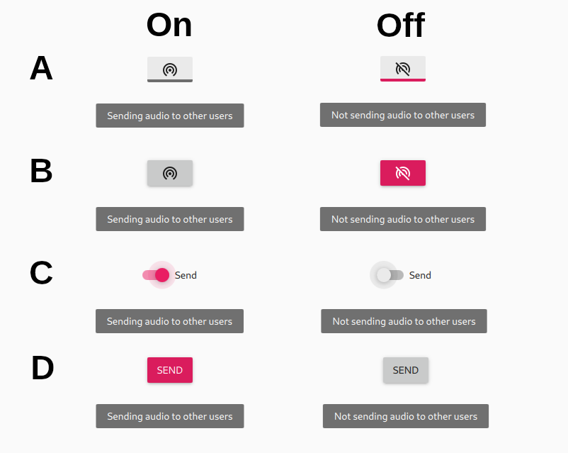
  • Icons vs text. Icons are more compact and clearly show the current state (enabled or disabled). Text is more specific but is slower/harder to read. Icons are more universal (easy to recognize for non-English speakers) but only if the meaning of the icon's picture is obvious.
  • Highlight when enabled vs when disabled. The Send button is enabled most of the time and therefore doesn't need to draw attention while enabled. It's easy to forget the button is disabled. Highlighting the button while disabled draws attention and reduces the chance that the user forgets to re-enable it after tuning, finding the key of the jam, etc. When a text label is used instead of an icon then the button is highlighted when enabled since it would be confusing to highlight “Send” when it's off.
  • Blinking. The button could even blink while disabled to draw more attention.
  • Tooltips. All of these UI designs include a tooltip message that appears when the mouse hovers over the button. The message provides a full explanation: “Sending audio to other users” or “Not sending audio to other users”.

Which option A, B, C, or D do you like best?

Any other comments?
just4fun
Deleted
shawnb
B is my favorite also.

Will it be the same for macs & pcs? I've only seen confusion here on the mac side.
BassHammer
I like B. It's easier to see when you are off
HighAction
I like B but i think when it sending it should be a color Like d and maybe pulsating
and if it too much trouble to link it to midi maybe you can assign it to a hot key like Ctrl Space .
as there are programs avilable to do this.
E.g https://obsproject.com/forum/threads/midikey2key-translates-midi-events-to-key-shortcuts.78103/
stefanha
Thanks for the feedback so far!

The UI will be the same on Windows, Mac, and Linux.

Support for controlling jammr via MIDI will be added.
spoofofallspoofs
I like C because it has the color and it has the text. This one seems the most intuitive to me. The icons are not necessarily universally understood, that's why i think text makes it very clear.

However given you have a tool tip, that makes the icons a good format.

I wouldn't introduce a blink, just my opinion!
This is a "lo-fi" version of our main content. To view the full version with more information, formatting and images, please click here.
Powered by DjangoBB